Exam Discussion Board
- What variable(s) are being graphed? List them and identify whether they are quantitative or qualitative.
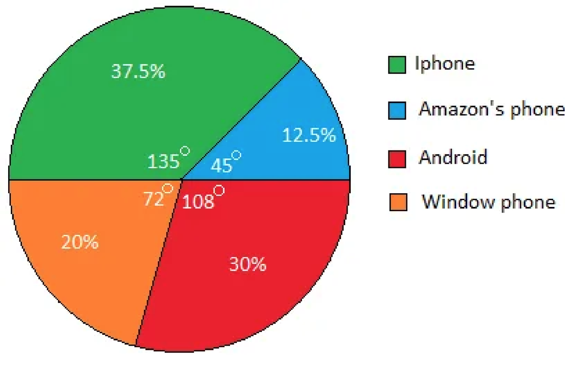
The variables being graphed are the type of phone by percentage. It is qualitative data - What type of graph did you chose? (bar graph, pie chart, etc.)
Pie Chart - Is this an appropriate graph for the type of variable being depicted? Why?
Yes, It is appropriate to use a pie chart to show a data set as percentages. It is a good visual to see what the most "popular phone" is. - Choose one of the variables being depicted and answer the appropriate question below:
- If it is a qualitative variable, identify the following:
- the most common category and the least common category - Most common is the iPhone and the lest common is the amazon phone
- the relative frequency for the most common category - 37.5%
- conjecture the number of individuals who would be in the most common category if there were 5,000 individuals - Roughly 1,875 individuals for the most common category
- If it is a qualitative variable, identify the following:
- Explain what message the graph is conveying. What is the reader supposed to understand from the graph? The graph is conveying how popular certain phones are. I think the reader should be able to see which phones are most popular, It seems to be pretty accurate because most commonly people argue over which phone is better and it seems to be between iPhone and Android.
I have learned so much in this statistics class, I started off not thinking that it would have much of an impact on a daily basis but I was very mistaken. Some forms of math I don't feel are all that applicable to what happens on the day to day. Statistics however is the very opposite. Since I have been in this class I have noticed some of the formulas and different terms in my everyday life. I have noticed them on the T.V while watching the news, at the hospital while I am working. The past couple of months have definitely been challenging because I took 1040 online, but it has also been rewarding as my understating grew on the importance of statistics. Statistics is in all of our lives everyday and I am grateful to have a greater knowledge of statistics now. Especially when talking about graphs, We are constantly talking about how we are doing in certain aspects of work and when it is broken down quarter by quarter and the improvements can be seen it is very helpful. I think that going forward this class has helped me to stop and analyze more often.
